

Simplifying Web Check-in for a Faster,
More Consistent Travel Experience
Simplifying Web Check-in for a Faster,
More Consistent Travel Experience
Simplifying Web Check-in for a Faster,
More Consistent Travel Experience
(SCROLL down)
Problem
Statement
Problem Statement
Problem
Statement
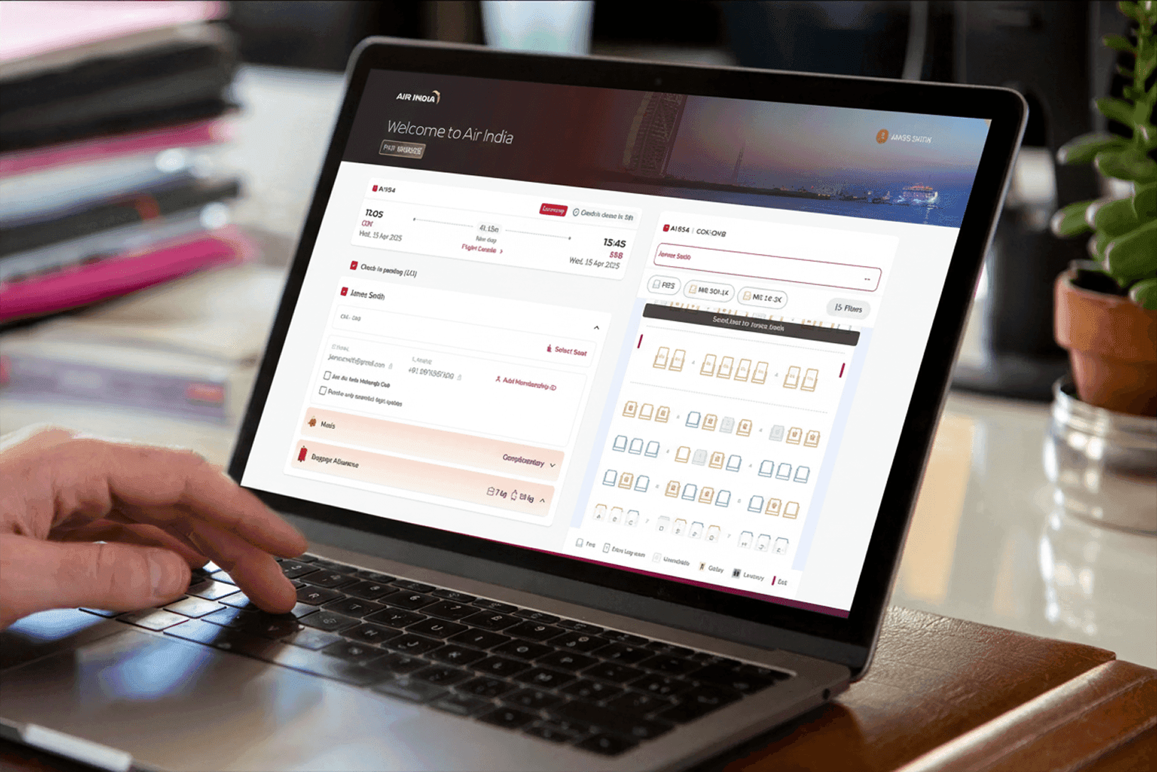
Redesigning Air India's web check-in platform by bringing the simplicity, visual consistency, and interaction principles of the native app to the web—while introducing new features such as Quick Check-in and a more refined end-to-end experience.
Redesigning Air India's web check-in platform by bringing the simplicity, visual consistency, and interaction principles of the native app to the web—while introducing new features such as Quick Check-in and a more refined end-to-end experience.
Air India's check-in experience was an important digital touchpoint, but the existing web journey had accumulated complexity and inconsistency.
The opportunity was to redesign with more modern, intuitive experience—bringing the simplicity, interaction patterns, and visual language of the native app into the web platform while introducing new capabilities such as Quick Check-in.
Air India's check-in experience was an important digital touchpoint, but the existing web journey had accumulated complexity and inconsistency.
The opportunity was to redesign with more modern, intuitive experience—bringing the simplicity, interaction patterns, and visual language of the native app into the web platform while introducing new capabilities such as Quick Check-in.

//
What was Broken?
//
What was Broken?
Creating a web experience that feels as
simple and intuitive as the app
Experience Not Built for
Frequent Travelers
Creating a web experience that feels as
simple and intuitive as the app
The existing web check-in journey involved multiple steps, repeated decisions, and interaction patterns that no longer reflected the evolving Air India digital experience.
At the same time, the native app was moving toward a cleaner and more intuitive product experience.
The challenge was:
How might we redesign web check-in to provide the simplicity and consistency of a native app experience, while introducing new capabilities that reduce effort and improve completion?
The existing web check-in journey involved multiple steps, repeated decisions, and interaction patterns that no longer reflected the evolving Air India digital experience.
At the same time, the native app was moving toward a cleaner and more intuitive product experience.
The challenge was:
How might we redesign web check-in to provide the simplicity and consistency of a native app experience, while introducing new capabilities that reduce effort and improve completion?
The existing web check-in journey involved multiple steps, repeated decisions, and interaction patterns that no longer reflected the evolving Air India digital experience.
At the same time, the native app was moving toward a cleaner and more intuitive product experience.
The challenge was:
How might we redesign web check-in to provide the simplicity and consistency of a native app experience, while introducing new capabilities that reduce effort and improve completion?

The journey required too many interactions.
The journey required too many interactions.

Information and actions were distributed across multiple screens.
Information and actions were distributed across multiple screens.
Customers repeated decisions and information unnecessarily.
Customers repeated decisions and information unnecessarily.
The web experience lacked consistency with the evolving mobile app.
The web experience lacked consistency with the evolving mobile app.
Important actions were not always prioritized clearly.
Important actions were not always prioritized clearly.
The journey could be faster for repeat and eligible travelers.
The journey could be faster for repeat and eligible travelers.
My Leadership
& Role
My Leadership & Role
My Leadership
& Role
As the Lead Product Designer, I led the experience redesign of the web check-in journey.
My responsibility went beyond updating the interface.
As the Lead Product Designer, I led the experience redesign of the web check-in journey.
My responsibility went beyond updating the interface.
I worked on defining:
I worked on defining:
The end-to-end check-in journey
The end-to-end check-in journey
Information architecture
Information architecture
Interaction patterns
Interaction patterns
Web adaptation of native app design principles
Web adaptation of native app design principles
Responsive behavior
Responsive behavior
UX quality across the journey
UX quality across the journey
I influenced
I influenced
Product direction and prioritization
Product direction and prioritization
Quick Check-in experience
Quick Check-in experience
Design-system consistency
Design-system consistency
Collaboration between Product, Data Science, Engineering and Design
Collaboration between Product, Data Science, Engineering and Design
New feature experiences
New feature experiences
Research
& Discovery
Research & Discovery
Research
& Discovery
Before redesigning the interface, I looked at the journey as a complete system.
The focus was to understand:
Where customers spent unnecessary time
Which decisions could be simplified
What information was already available
Which interactions created friction
How the web and mobile experiences could feel more consistent
The goal was not to make the web platform identical to the mobile app.
Instead, it was to apply the same product principles while respecting the strengths and constraints of a larger web interface.:
Before redesigning the interface, I looked at the journey as a complete system.
The focus was to understand:
Where customers spent unnecessary time
Which decisions could be simplified
What information was already available
Which interactions created friction
How the web and mobile experiences could feel more consistent
The goal was not to make the web platform identical to the mobile app.
Instead, it was to apply the same product principles while respecting the strengths and constraints of a larger web interface.:
Key Insight
A better web experience doesn't mean copying the mobile app.
The native app provided a useful reference for:
Simpler interaction patterns
Clearer information hierarchy
Focused user flows
Consistent visual language
Faster decision-making
But web users have different needs.
Larger screens
More available information
Different interaction behaviors
More room for comparison and review

Key Insight
A better web experience doesn't mean copying the mobile app.
The native app provided a useful reference for:
Simpler interaction patterns
Clearer information hierarchy
Focused user flows
Consistent visual language
Faster decision-making
But web users have different needs.
Larger screens
More available information
Different interaction behaviors
More room for comparison and review
Design
Principles
Research & Discovery
Design
Principles
01 — Make it familiar
01 — Make it familiar
Interaction patterns
Navigation logic
Visual hierarchy
Components
Key actions
Interaction patterns
Navigation logic
Visual hierarchy
Components
Key actions
02 — Reduce unnecessary effort
02 — Reduce unnecessary effort
Repeated information
Unnecessary screens
Redundant decisions
Excessive interactions
Repeated information
Unnecessary screens
Redundant decisions
Excessive interactions
03 — Prioritize the primary task
03 — Prioritize the primary task
Check-in is the main goal.
The experience needed to make it easy for customers to understand:
What do I need to do next?
Optional services and secondary actions should support the journey—not compete with it.
Check-in is the main goal.
The experience needed to make it easy for customers to understand:
What do I need to do next?
Optional services and secondary actions should support the journey—not compete with it.
02 — Reduce unnecessary effort
02 — Reduce unnecessary effort
Repeat and eligible users should not have to move through the same lengthy journey every time.
This led to the development of Quick Check-in.
Repeat and eligible users should not have to move through the same lengthy journey every time.
This led to the development of Quick Check-in.
Key Insight
Frequent travelers don't need another booking journey. They need the product to remember the journey they've already chosen.
Key Insight
Frequent travelers don't need another booking journey. They need the product to remember the journey they've already chosen.
Web check-in experience, designed to help travelers complete check-in quickly through a streamlined journey, intelligent seat and service options, and instant access to their boarding pass.
Web check-in experience, designed to help travelers complete check-in quickly through a streamlined journey, intelligent seat and service options, and instant access to their boarding pass.
From booking flow to
Intelligent action
From booking flow to
Intelligent action
From booking flow to
Intelligent action
The traditional experience asked travelers to progress through the same sequence every time. The new model shifted the product from asking users to remember everything toward helping the product remember useful patterns.

//
What We Built
//
What We Built
Afasterpathforeligibletravelers
Afasterpathforeligibletravelers
Afasterpathforeligibletravelers
One of the key additions to the redesigned experience was Quick Check-in.
The idea was simple:
If the system already has the information required to complete the journey, why should the customer repeat the same process?
For eligible users, Quick Check-in provided a simplified path by using relevant information already associated with the booking.
One of the key additions to the redesigned experience was Quick Check-in.
The idea was simple:
If the system already has the information required to complete the journey, why should the customer repeat the same process?
For eligible users, Quick Check-in provided a simplified path by using relevant information already associated with the booking.
The experience allowed customers to:
Review their journey
Review their journey
Confirm relevant information
Confirm relevant information
Make changes if required
Make changes if required
Complete check-in faster
Complete check-in faster

From a fragmented flow to
a more guided experience
Research & Discovery
From a fragmented flow to
a more guided experience
Journey review
Journey review
The first step helps customers quickly understand:
Their flight
Passenger details
Journey status
Relevant next actions
The first step helps customers quickly understand:
Their flight
Passenger details
Journey status
Relevant next actions
Passenger information
Passenger information
Information was reorganized to improve readability and reduce unnecessary cognitive load.
The focus was to help customers quickly answer:
Is everything correct?
Information was reorganized to improve readability and reduce unnecessary cognitive load.
The focus was to help customers quickly answer:
Is everything correct?
Seat selection
Seat selection
The seat-selection experience was refined to make:
Available options easier to understand
Seat information easier to scan
Selection actions more obvious
The overall interaction more consistent with the Air India app experience
The seat-selection experience was refined to make:
Available options easier to understand
Seat information easier to scan
Selection actions more obvious
The overall interaction more consistent with the Air India app experience
Additional services
Additional services
Optional services were integrated into the journey without distracting from the primary check-in task.
The experience needed to balance:
Customer completion and commercial opportunities.
Optional services were integrated into the journey without distracting from the primary check-in task.
The experience needed to balance:
Customer completion and commercial opportunities.
Confirmation
Confirmation
The redesigned confirmation experience provides a clearer end state and helps customers understand what happens next.
The redesigned confirmation experience provides a clearer end state and helps customers understand what happens next.
//
Business Impact
//
Business Impact
EzBookingdeliveredmeasurableimprovementsinloyaltyengagementandconversion.
EzBookingdeliveredmeasurableimprovementsinloyaltyengagementandconversion.
EzBookingdeliveredmeasurableimprovementsinloyaltyengagementandconversion.
✅
Check‑in completion rate +35%
✅
Check‑in completion rate +35%
✅
Check‑in completion rate +35%
📈
Repeat bookings increased 42%
📈
Repeat bookings increased 42%
📈
Repeat bookings increased 42%
💎
CLV increased 2.3×ease
💎
CLV increased 2.3×ease
💎
CLV increased 2.3×ease
💰
₹280 crore annual revenue potential
💰
₹280 crore annual revenue potential
💰
₹280 crore annual revenue potential
📈
NPS improved –8 → +41
📈
NPS improved –8 → +41
📈
NPS improved –8 → +41
💺
Paid seat conversion +125%
💺
Paid seat conversion +125%
💺
Paid seat conversion +125%
Key Learnings
Creating a foundation for future check-in experiences. The redesign wasn't treated as a collection of updated screens. I approached it as a product system.
This involved defining: Reusable UI patterns, Consistent interaction behaviors, Responsive components, Clear hierarchy rules, Patterns for optional services, Reusable confirmation and feedback states. The result was a more consistent foundation that could support future improvements to the check-in journey.
Key Learnings
Creating a foundation for future check-in experiences. The redesign wasn't treated as a collection of updated screens. I approached it as a product system.
This involved defining: Reusable UI patterns, Consistent interaction behaviors, Responsive components, Clear hierarchy rules, Patterns for optional services, Reusable confirmation and feedback states. The result was a more consistent foundation that could support future improvements to the check-in journey.
Key Learnings
Creating a foundation for future check-in experiences. The redesign wasn't treated as a collection of updated screens. I approached it as a product system.
This involved defining: Reusable UI patterns, Consistent interaction behaviors, Responsive components, Clear hierarchy rules, Patterns for optional services, Reusable confirmation and feedback states. The result was a more consistent foundation that could support future improvements to the check-in journey.
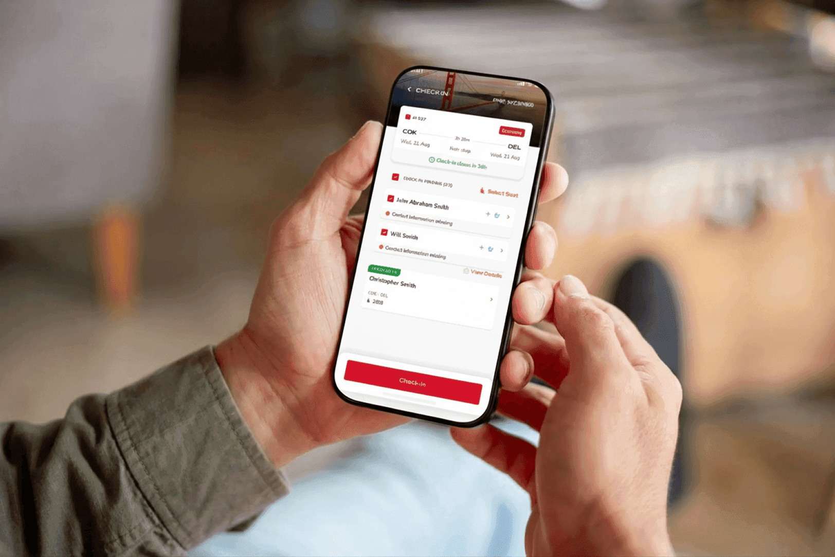
Reimagining Check-in
Native Mobile UX
Reimagining Check-in
Native Mobile UX
View Casestudy
View Casestudy